Streamlining Multiple Content Formats in a single feed.
Streamlining Multiple Content Formats in a single feed.
Reducing the cognitive load and learning curve on users when dealing with multiple products within the same app
Reducing the cognitive load and learning curve on users when dealing with multiple products within the same app

Overview
Volume is an integrated content platform designed as a comprehensive destination to keep you informed. It uniquely combines various types of content, offering both breadth and depth in information access.
Our journey in creating Volume centered around developing an all-encompassing content application. This app simplifies the process for users to stay updated without effort, managing a diverse array of content types that enrich the user's understanding from multiple perspectives.
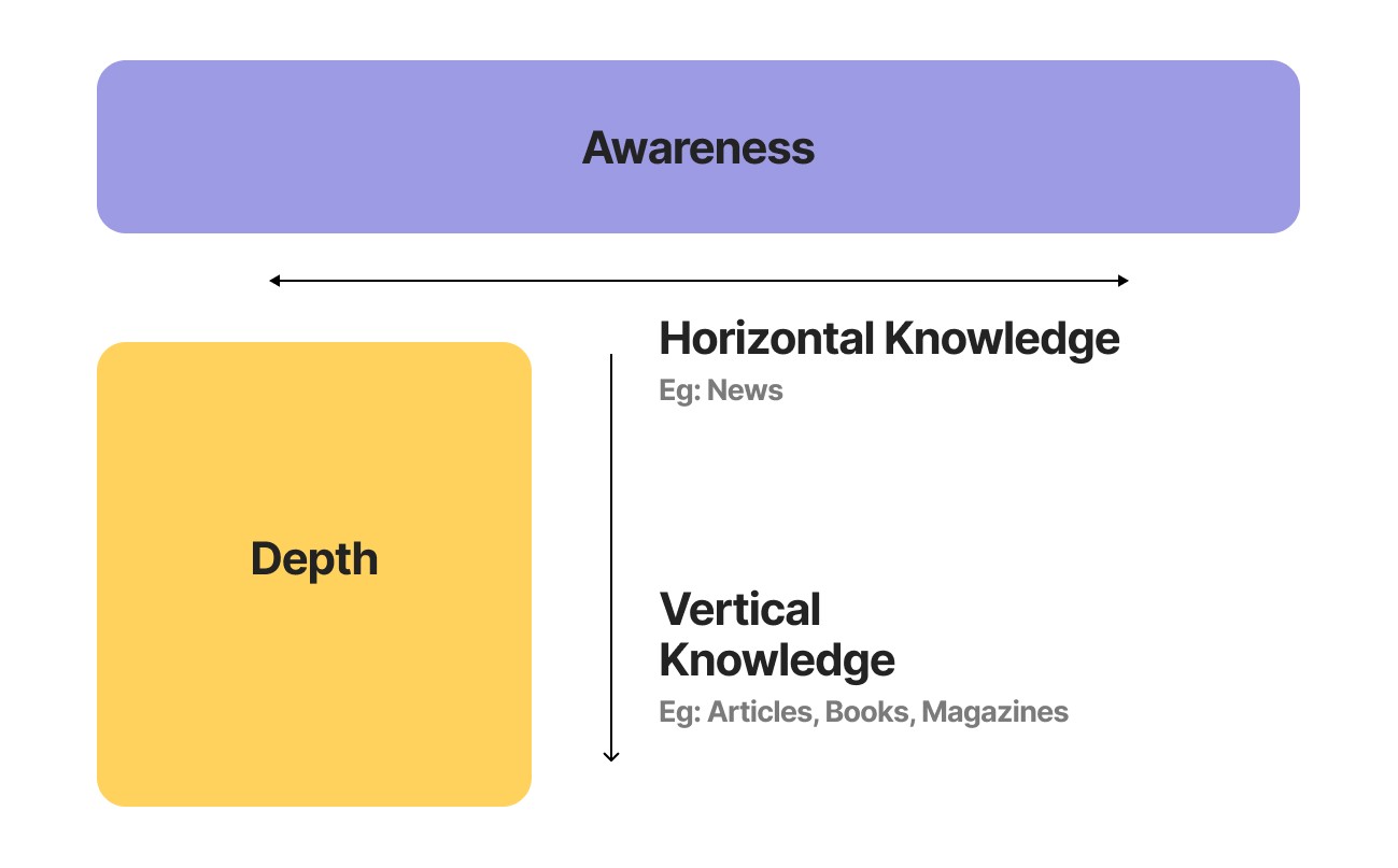
At a top level, all informative content can be divided into two types:
Content that broadens horizontal awareness, such as news, which keeps users informed about the world around them.
Content that deepens vertical knowledge, including books, articles, magazines, and series, allowing users to explore subjects in detail.


Each content type is a standalone product, with their own respective competitors:
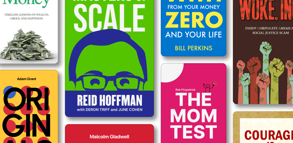
Book Summaries are akin to Blinkist, offering concise versions of full-length books.
News is aggregated similarly to platforms like Flipboard or Feedly, gathering top stories from various sources.
Articles are comparable to reading experiences on Medium, Substack, or Refind, featuring in-depth explorations of specific topics.


The Problem
The Problem
Creating a unified content platform that seamlessly integrates diverse content types without overwhelming users or requiring a steep learning curve.
Creating a unified content platform that seamlessly integrates diverse content types without overwhelming users or requiring a steep learning curve.
Creating a unified content platform that seamlessly integrates diverse content types without overwhelming users or requiring a steep learning curve.
In most content platforms, the catalog takes center stage. This is evident in OTT streaming services (like Netflix and Prime), on-demand music services (like Spotify and Apple Music), and even ebook platforms (like Kindle and Audible).
The Catalog View
The catalog view is a powerful tool for increasing a content platform's perceived value. It showcases size, builds credibility, and most importantly, it increases the perceived value that justifies a subscription.
A well-organized catalog view can help users discover content they might not have actively searched for.


We tackled the challenge of presenting multiple content types by creating a unified home screen. This page which the first users encounter upon opening the app, showcases a carefully curated mix of all available content types, each neatly organized into distinct sections.
This design allows users seeking specific content to seamlessly navigate to their desired section with ease.


Ok. Maybe not the best solution.
Learnings and Insights
While the catalog approach excels at convincing users of a platform's perceived value, it might not be the best mechanism for fostering long-term retention.
This becomes evident in the phenomenon of decision paralysis.
We've all experienced spending 10-15 minutes browsing Netflix, overwhelmed by options, before finally settling on a single show.
But think about the user commitment here. One book or TV show is worth about 15 hours of commitment. The 10-15 minutes lost in deciding makes up for the sheer length of the content consumed.

This is not true for platforms that cater to shorter content.
Platforms like Medium, which primarily deal with shorter content (like articles averaging 10 minutes), present a different case.
Here, the catalog approach can lead to a more significant barrier to user retention. The 10-15 minutes spent wading through a sea of articles can feel like half the total engagement time, creating a frustrating user experience.
Turning down the Volume
How we completely broke down the homescreen to build something better.
Catalog may offer a powerful way to showcase a platform's depth and variety. However, for users seeking a more focused and streamlined experience, the Daily Digest presents a compelling alternative. Think of it as your own personal content concierge, delivering a carefully curated selection of the platform's best offerings directly to your main feed.
So we decided to remove all the clutter on our homefeed to limit it to a maximum of 6 to 7 reads everyday.
The Daily Digest goes beyond simple algorithms. Human curated with a deep understanding of user preferences and content quality handpick the featured content. This ensures a high bar for inclusion, guaranteeing users encounter only the most engaging and relevant content available.
The Daily Digest tackles the challenge of decision paralysis by presenting a manageable amount of high-quality options, building a sense of confidence in the platform's recommendations.


While the Daily Digest offers a curated experience, it doesn't restrict exploration. Users can still access the full catalog and delve deeper into specific content categories if they wish.
The Daily Digest serves as a springboard for discovery, offering a taste of the platform's richness while ensuring users don't miss out on the best content it has to offer.
Analysis on Catalog vs Digest View
Catalog views offer a powerful way to showcase a platform's depth and variety. However, for users seeking a more focused and streamlined experience, the Daily Digest presents a compelling alternative. Think of it as your own personal content concierge, delivering a carefully curated selection of the platform's best offerings directly to your main feed.
Catalog View:
Strengths:
Overwhelm with Abundance: Creates a sense of vastness and potential, highlighting the platform's size and variety.
Discovery Powerhouse: Users can explore a wide range of content, potentially uncovering hidden gems or niche favorites.
Increased Perceived Value: The sheer volume of offerings justifies subscription costs in the user's mind.
Weaknesses:
Decision Paralysis: Too many choices can overwhelm users, making it difficult to know where to start.
Low Engagement: Users might get lost in the sea of content, leading to frustration and decreased engagement.
Less Focus on Personalization: Catering to a broad audience can dilute the user experience for individuals with specific preferences.
Digest View:
Strengths:
Laser Focus: Highlights a few well-chosen pieces of content, offering a clear and targeted user experience.
Increased User Confidence: Users can feel confident that the presented content is high-quality and worth their time.
Personalization Potential: Curated views can be personalized based on user preferences, offering a more relevant and engaging experience.
Weaknesses:
Limited Discovery: Users might miss out on a broader range of content outside the curated selection.
Perceived Lack of Value: A smaller content pool could lead to questions about subscription justification.
Requires Deep User Understanding: Effective curation relies heavily on accurate user data and understanding of preferences.
Redesigning The Onboarding Experience
Educating the user to navigate amidst multiple products with minimal learning curve.
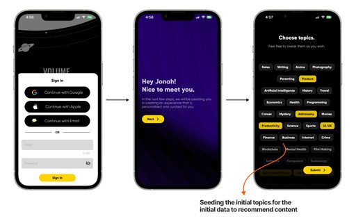
When developing the app, we initially faced the challenge of how to introduce multiple content types to users during the onboarding process. However, we quickly realized the importance of focusing on conveying the app's value proposition rather than delving into the complexities of each content type upfront.
This approach streamlined the onboarding experience, emphasizing the benefits users would gain. Once users began interacting with the app, we introduced specific content types and their respective tutorials contextually, as they engaged with each one. This significantly reduced the cognitive load on users, freeing them from having to remember operational details and allowing them to immerse themselves in the content immediately.




Impact
Catalog views offer a powerful way to showcase a platform's depth and variety. However, for users seeking a more focused and streamlined experience, the Daily Digest presents a compelling alternative.
This change increased the day 1 purchase of premium subscription by 67% compared to the previous cohorts from a week before this change.
Think of it as your own personal content concierge, delivering a carefully curated selection of the platform's best offerings directly to your main feed.
Closing Notes
Catalog views offer a powerful way to showcase a platform's depth and variety. However, for users seeking a more focused and streamlined experience, the Daily Digest presents a compelling alternative.
This change increased the day 1 purchase of premium subscription by 67% compared to the previous cohorts from a week before this change.
Think of it as your own personal content concierge, delivering a carefully curated selection of the platform's best offerings directly to your main feed.
Let's get to know each other.
Let's get to know each other.
Let's get to know each other.
© Jonah Jacob Eapen 2024