Building the Reading Experience for Book Guides on Volume
Building the Reading Experience for Book Guides on Volume
Crafting a user interface that’s gentle to your sight and intuitive
Crafting a user interface that’s gentle to your sight and intuitive
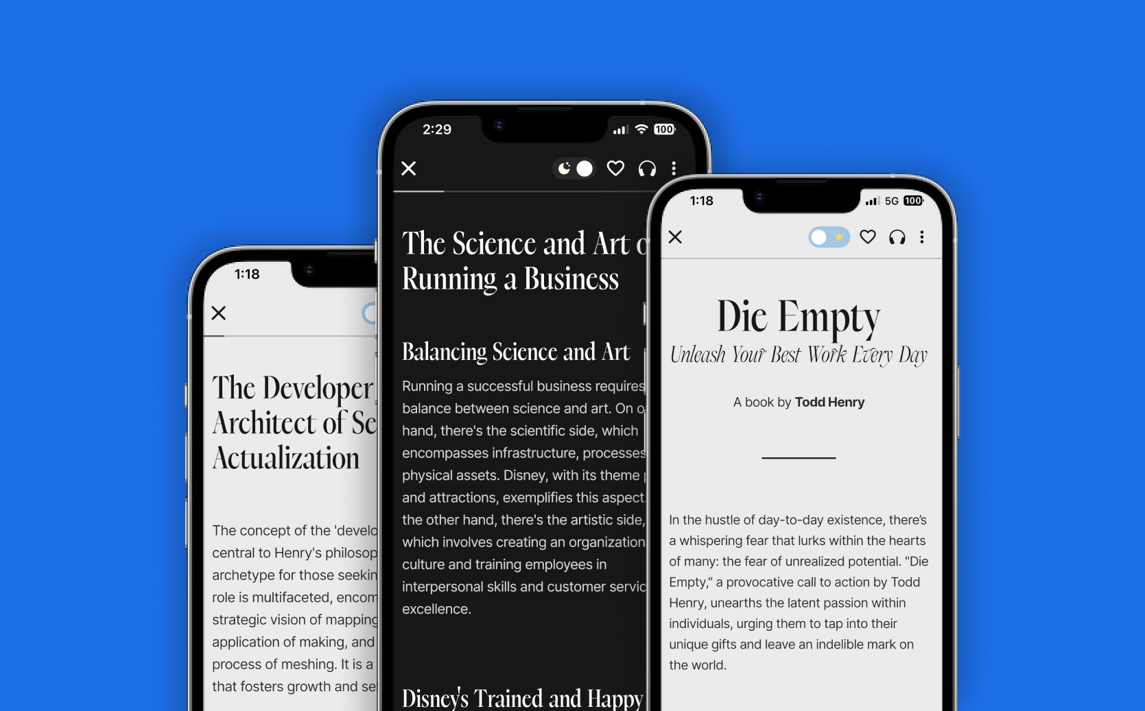


Overview of the Problem
What is a Book Guide?
A book guide is essentially a condensed version of a bestselling book, presented in the form of an article that lasts about five minutes.
It's designed to give readers a quick and insightful overview of the book, breaking down its content into key insights and point notes for easier consumption. This format is particularly useful for those looking to grasp the essence of a book without investing the time to read it in its entirety.
The Inefficiency:
However, we encountered a significant challenge with our existing presentation model for these book guides.
Initially, we adopted the same approach used for magazines and series, showcasing the guides through image carousels. This method, though visually appealing, proved to be inefficient for book guides, which are less dependent on images and more on text to convey their value.
The design process for each carousel was time-consuming and didn't add any substantial benefit to the user's experience or understanding of the guide. Recognizing this inefficiency, we decided to overhaul our system, eliminating the design phase for these guides to save time and better align with the core value they offer.


Approach
Recognizing the text-centric nature of our book guides, we shifted our focus towards enhancing the typography, making it the cornerstone of our new reader interface.
This decision was influenced by the limitations of our previous carousel viewer, which, while visually engaging, hindered basic functionalities such as translation, text copying, and dictionary use. These essential features were incompatible with the carousel format due to the complex integration required with Optical Character Recognition (OCR) and Computer Vision, thus prompting us to seek a more text-friendly solution that could seamlessly support these user needs.
Markdown (?)
In our quest for an optimal format to present the rich text of our book guides, we initially considered Markdown (MD) for its simplicity and widespread familiarity among developers.
However, Markdown's inherent limitations, such as its restricted styling options and the difficulty in embedding complex multimedia content, steered us towards a more versatile solution.
Why we chose HTML instead
We ultimately opted for HTML as our format for rich text, given its native compatibility with the web and its ability to seamlessly integrate into desktop and tablet versions of Volume in the future.
This choice eliminated the need for importing Markdown viewer packages, offering a more streamlined, future-proof approach.
HTML's native support across all browsers ensured that once content is created, we wouldn't need to revisit or modify the file format for future releases, aligning with our long-term vision for efficiency and ease of use.


Typography
To elevate the overall aesthetic and ensure our book guides resonated with a sense of premium editorial quality, careful consideration was given to the selection of typography.
For headings and bylines, we chose "Dark Paradise," utilizing its bold and italic variations from the serif font family. Its narrow structure lends a distinctive elegance to the typography, reminiscent of high-end magazines and editorials. For the body text, we opted for the "Inter" Font family, known for its universal appeal and readability. The Inter font, with its clean lines and adaptable weight, ensures that our content is accessible and pleasant to read across various devices and screen sizes, enhancing the overall user experience by making it straightforward and engaging.


Building for Accessibility
Learnings and Insights
In further refining the reading experience, our next objective was to select the appropriate color schemes, incorporating both dark and light modes to enhance accessibility for a wider audience.
Ensuring that the chosen background and text colors were compatible with WebAIM standards was crucial. This compatibility aimed to guarantee that our content was easily readable and visually comfortable for users with varying visual preferences and needs, including those with visual impairments.
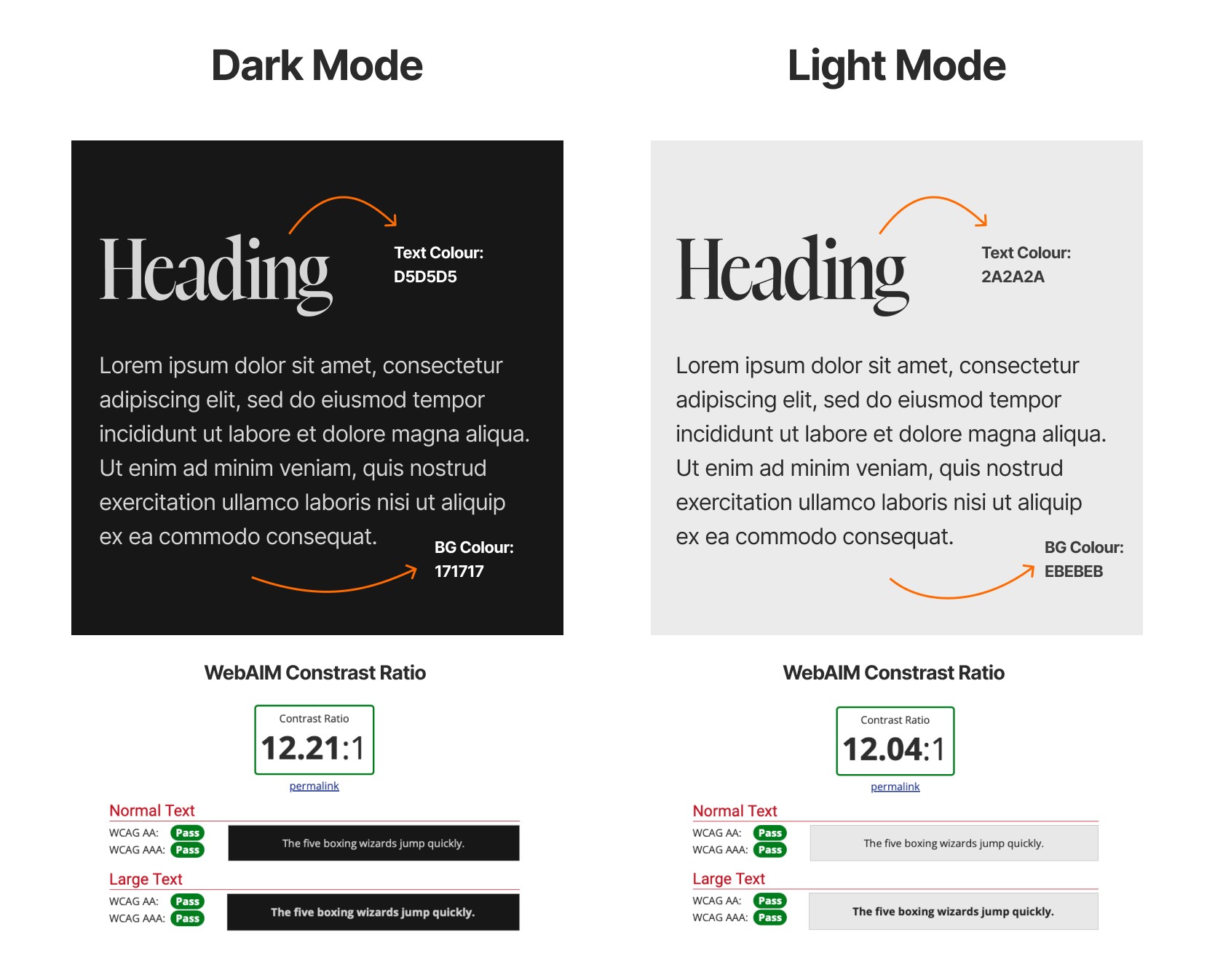


By adhering to these guidelines, we aimed to create an inclusive environment that respects and accommodates the diverse requirements of our readers, making our book guides not only informative but also universally accessible.
By adhering to these guidelines, we aimed to create an inclusive environment that respects and accommodates the diverse requirements of our readers, making our book guides not only informative but also universally accessible.
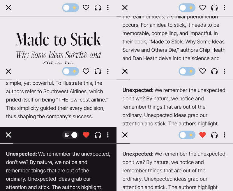
Formatting
The decision to adopt HTML for our formatting needs streamlined our content delivery process significantly. As a universally accepted standard, HTML enabled us to finalize the appearance of our book guides with minimal deviations from the originally finalized content.
This has resulted in a removal several layers of processing, allowing our content team to directly format and prepare the content in HTML. This direct approach to content formatting not only simplifies the workflow but also ensures that the final product retains its intended design and structure, making it readily accessible and consistent across all platforms.


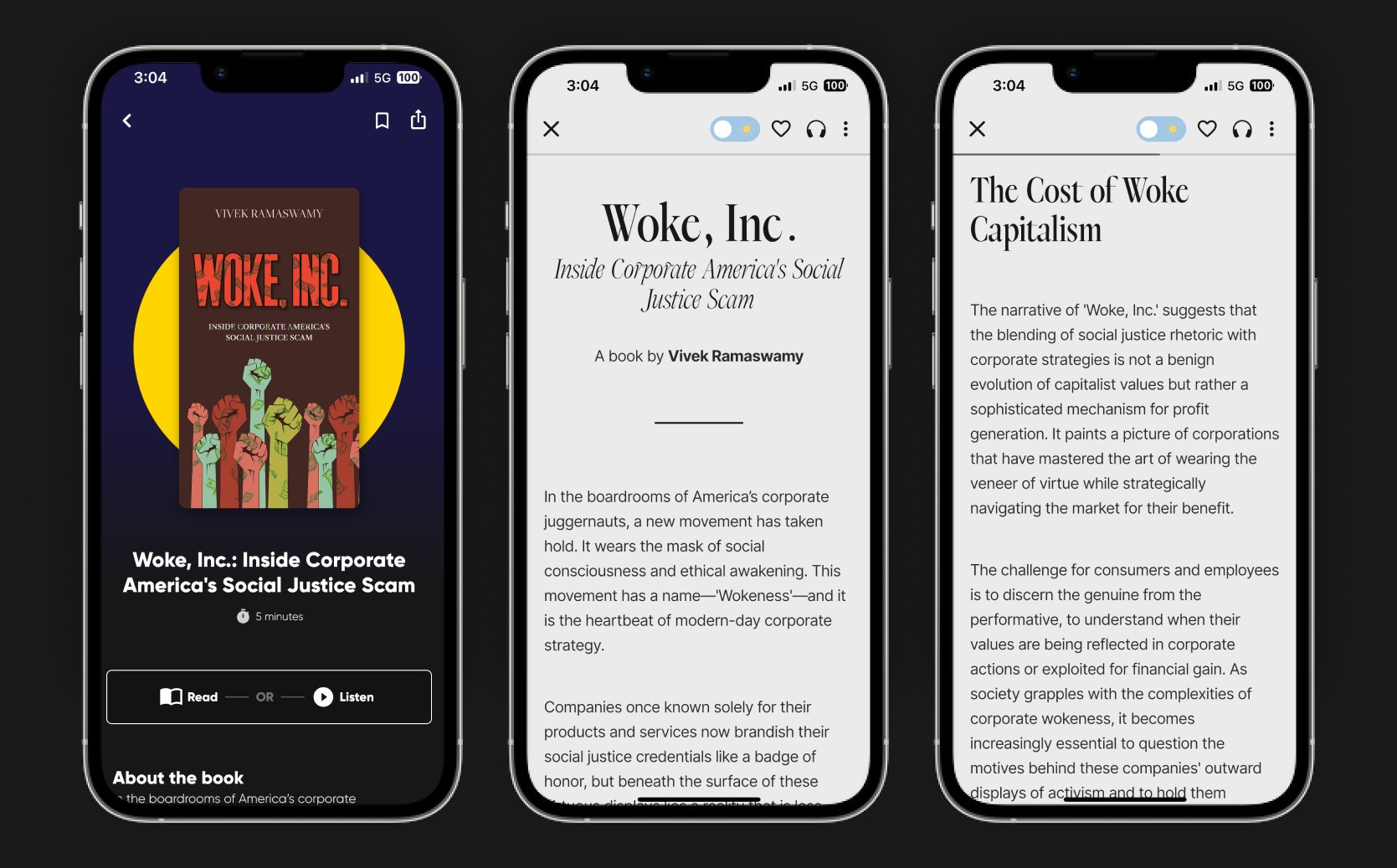
Final Shots
How it came out to be.
Final Shots




Impact
Transitioning to this typography-focused approach has significantly streamlined our production process, resulting in an impressive 80% increase in the speed of creating book guides.
This efficiency gain not only accelerates the time-to-market for each guide but also allows our team to devote more resources to enhancing content quality and exploring new titles.
Let's get to know each other.
Let's get to know each other.
Let's get to know each other.
© Jonah Jacob Eapen 2024